 01
Individualistic
Make room for personal expression and a distinctive way of experiencing adventure.
 Airwalk
Reimagining Airwalk as an invitation
to step beyond the familiar.
 AIRWALK / Strategy, development & standards ↗
How could a brand rooted in skate culture inspire a broader world of exploration and self-expression?
This educational rebrand builds on Airwalk’s roots in skate and action-sports culture. “Dare to Dare” expands that spirit into a brand that encourages people to explore, express their individuality, and overcome their fears through new experiences.
My strategy guide identifies Airwalk’s connection to the skate and action-sports community as the starting point for expansion. The proposal carries that spirit into sports, entertainment and lifestyle through destinations, events and media.
The audience exploration includes six target personas and two outsider profiles. Three pillars organize the direction: personal expression, pursuing a passion, and building confidence through unfamiliar experiences.
01Make room for personal expression and a distinctive way of experiencing adventure.
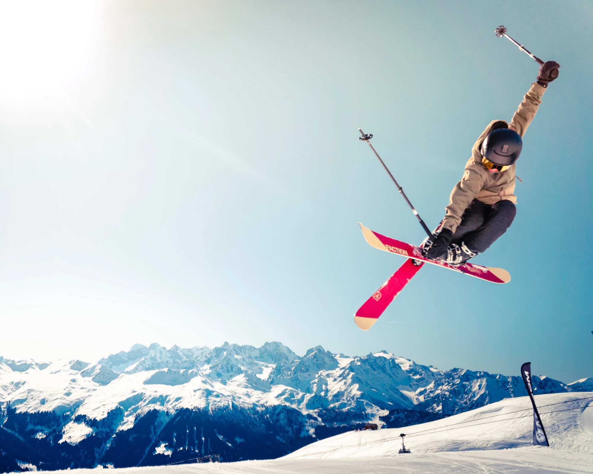 02
Create opportunities to discover what moves you and pursue it further.
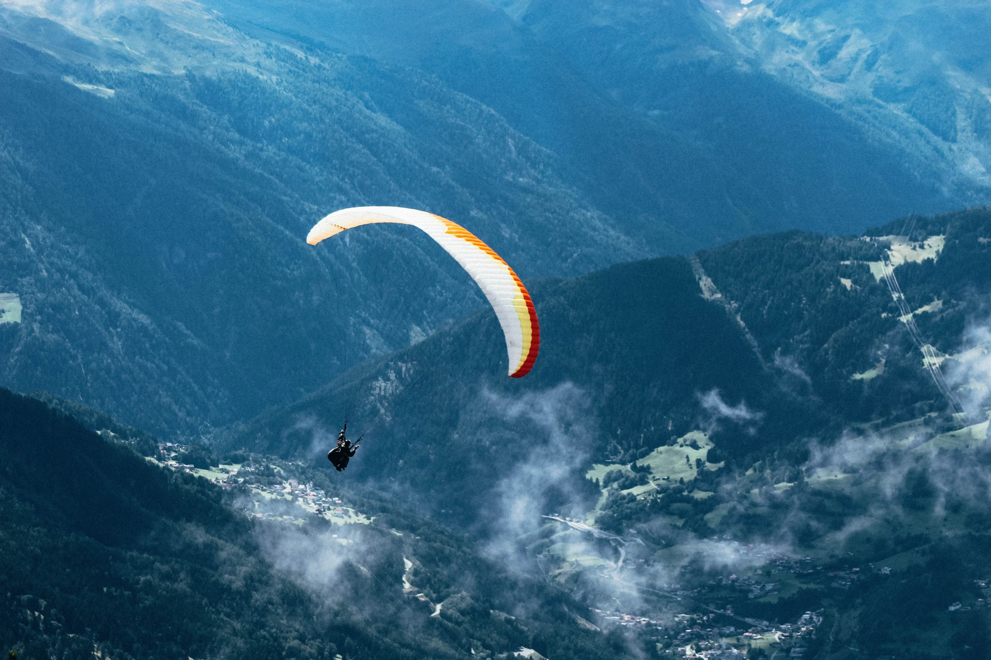 03
Build confidence through unfamiliar challenges and new experiences.
I began with three directions—Misfit, Revolution and Passion—exploring each through symbols, graphics and wordmarks. The second round narrowed to Passion and Misfit; the third focused on Passion, combining an A with a lightning bolt to express energy.
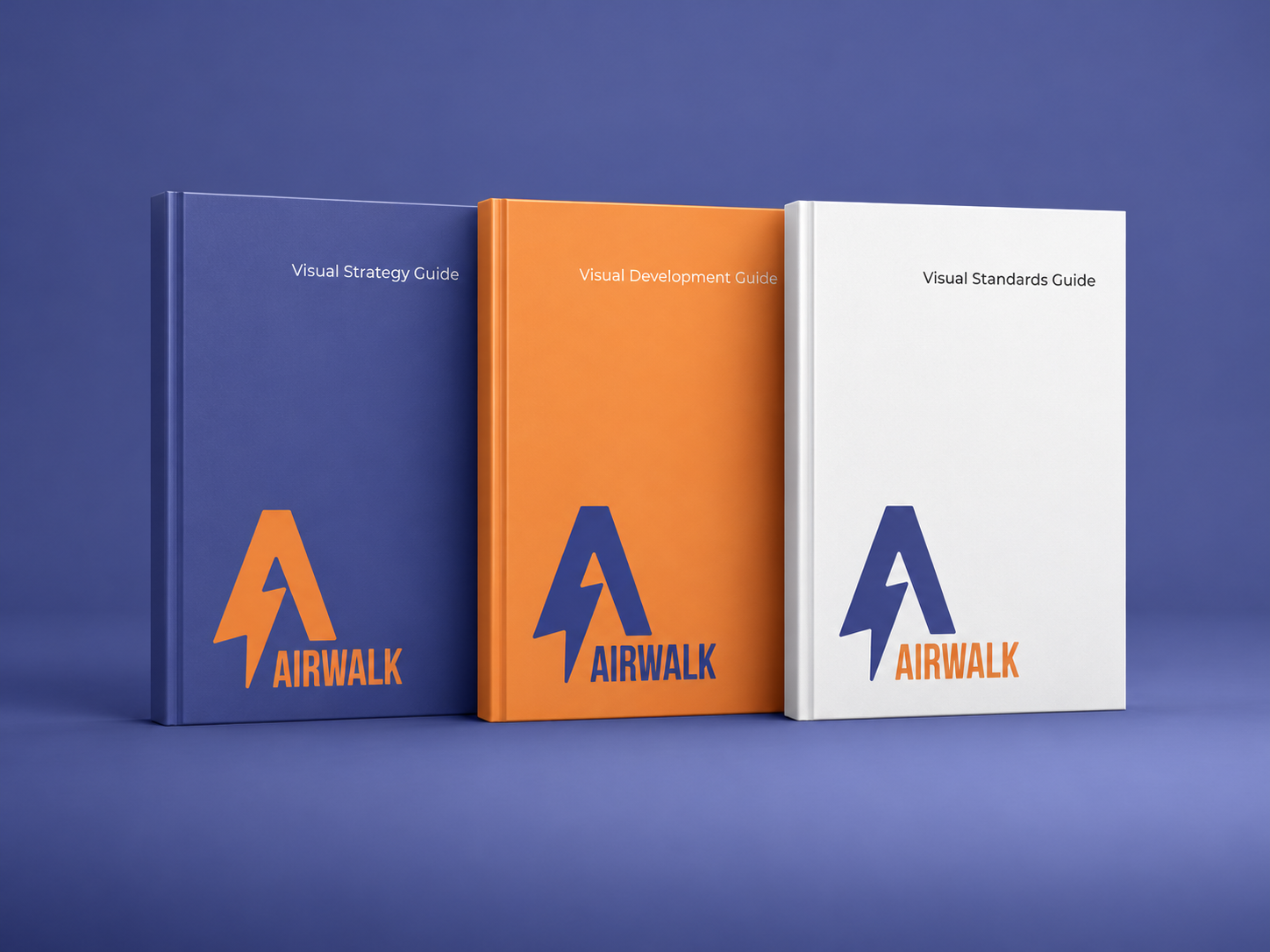
Three publications document the progression from brand strategy to visual exploration and standards for applying the identity.

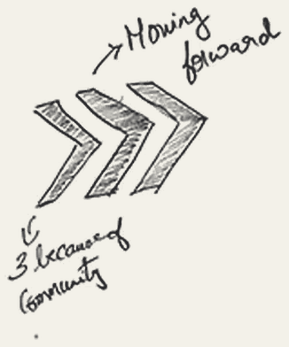
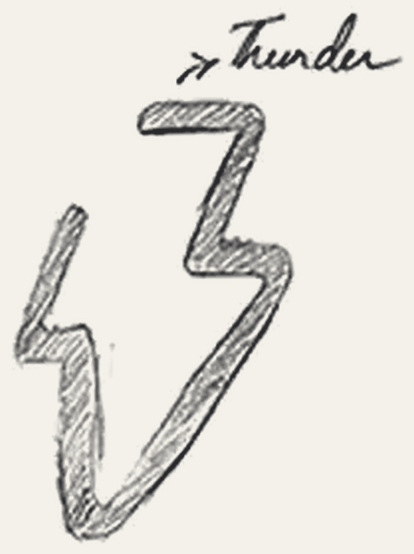









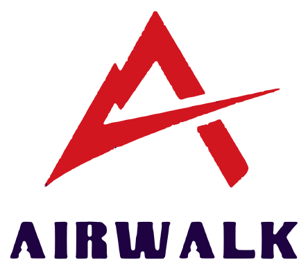








The mark combines the letter A with a lightning bolt, evoking the power of thunder and the energy of movement. Its sharp, forward-driving form expresses passion and the courage to push beyond familiar limits. The identity pairs Passion Indigo with Energetic Orange, supported by white and black.
Brand background, audience, mission, and future direction.
Explore the strategy guide ↗The evolution of a cohesive visual language.
Explore the development guide ↗Guidance for the identity and its proposed extensions.
Explore the standards guide ↗The proposed extensions give the brand idea different roles: recording an adventure, learning a skill, exploring unfamiliar terrain, and sharing stories of overcoming fear.
The Airwalk Action camera invites individuals to capture unique experiences while participating in extreme sports. The concept extends the brand’s fearless spirit into a tool for recording and sharing adventure.
View original concept ↗A proposed training environment connects the brand to learning and participation. The pool application shows the identity operating at an environmental scale.
View original concept ↗The projection map connects products, environments, events, education, experiences, and collaborations to the three brand pillars. Each proposed extension supports a shared mission: encouraging individuals to be fearless.
The lightning-bolt mark and indigo–orange palette connect the guidebooks, product concepts and environments. Repeating these elements gives the varied proposals a shared visual language.
Explore more work“Dare to Dare” reimagines Airwalk beyond its original offerings while retaining its connection to action-sports culture. The project brings together strategy, a new visual identity, and proposed experiences that celebrate individuality, passion, and the willingness to overcome fear.