Lamar’s communications needed to stay recognizable across different audiences, messages and formats.
I developed the concepts for the work shown here from scratch and carried them through final execution for prospective advertisers, clients and internal teams. I also built reusable layouts and guided interns and junior designers through design reviews.
Lamar · June 2023–January 2025 Senior Graphic Designer → Senior Digital Designer
02 / Political campaign
One campaign. Across formats.
The brief: Promote Lamar’s out-of-home advertising opportunities to political advertisers for the 2024 election cycle. Keep the campaign cohesive while giving each message its own focus.
Campaign email series
Keep the identity. Change the emphasis.
My decision: Keep the blue palette, red emphasis and campaign emblem consistent. Change the focal point to suit the message: a statistic for exposure, a billboard for digital capabilities, and location markers for voter targeting.
Exposure / Lead with the statistic.Digital capabilities / Show the advertising format.Voter targeting / Use location as the visual cue.
Statistics are part of the supplied campaign messaging, not measured outcomes of my design work.
Campaign video / Collaboration
Specify the sequence. Guide the animation.
My direction: I developed the concept, created the video graphics and guided the piece through final delivery. My animation notes specified text entrances, movement and sequencing—including having the arrows appear one by one. Lamar’s video team animated the final piece under my direction.
Graphics & animation notes: Roshni Vasudevan Animation: Lamar video team
Landing page / Countdown billboardSelf-promotion / Social-media billboard
View earlier campaign versions+
Earlier explorations
Finding the visual direction.
Earlier versions explored blue and violet palettes, different type treatments, and alternative placements for the message and campaign emblem.
Earlier campaign explorations / Typography, color and layout studies.
03 / Social Savvy
An identity built for reuse.
The brief: Create an identity for Social Savvy, an internal initiative sharing sales and social-media tips with Lamar offices across the country.
Responding to feedback
Simplify the mark. Clarify the message.
My decision: After feedback called for a simpler, more brand-aligned identity, I refined the wordmark toward lighter linework and readable lettering. The composition keeps the session title and call to action clear.
Social Savvy / New Year Refresher session announcement
A reusable template
One layout. A new topic.
Built for reuse: Junior designers and other designers could update the session text without changing the established layout. The wordmark, topographic pattern, Lenny character and call to action stay in place across these two examples.
Social Savvy / Showcase local creativeSocial Savvy / Celebrate national holidays
View earlier wordmark versions+
Wordmark explorations
Exploring the personality of type.
These earlier versions explore different ways to pair “Social” and “Savvy”—from bold stacked lettering to lighter script overlays, with variations in color and emphasis.
Flowing scriptInterlocking letterformsBold sans serifBold serifStacked two-tone letteringLayered script and capitalsHigh-contrast serifFine script overlaySerif and script pairingCondensed capitalsRed script accentRed capitals with white script
04 / Guidance & review
Guidance through design review.
I guided 3–4 interns and junior designers through weekly reviews and feedback as needed. My director retained final approval.
Review the fundamentals.
My feedback focused on hierarchy, spacing, typography and adherence to the brand. For a Lamar company event, I helped junior designers refine menus and swag items before my director’s review.
Make recurring work reusable.
I built layouts for email footers, Social Savvy, Bright Ideas and programmatic case studies, using them myself and making them available to other designers. Replacing text and images within an established structure made recurring production faster for me.
Email design, a recurring newsletter header and seasonal animation.
View selected supporting work+
Email design & animation
Reaching festival audiences.
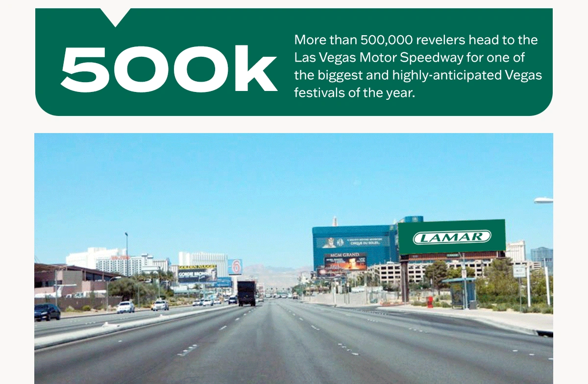
I designed the email header and animated footer for a Lamar promotion aimed at prospective advertisers seeking to reach Electric Daisy Carnival visitors in Las Vegas. The header presents the billboard opportunity; the footer pairs audience information with billboard locations.
EDC / Email headerEDC / Animated email footer
A recurring newsletter identity
Bright Ideas
I designed the header for Bright Ideas, a weekly client newsletter showcasing out-of-home (OOH) advertising. My contribution was the header only; the newsletter copy and featured billboard creative are shown for context.
Bright Ideas / Header with newsletter content
Seasonal design & animation
A little play.
I designed and animated the holiday and Halloween greetings and created the seasonal artwork for Thanksgiving. The holiday greeting loops with a pause control; select play to watch Halloween.
03 / Social Savvy
An identity
built for reuse.
The brief: Create an identity for Social Savvy, an internal initiative sharing sales and social-media tips with Lamar offices across the country.
Responding to feedback
Simplify the mark.
Clarify the message.
My decision: After feedback called for a simpler, more brand-aligned identity, I refined the wordmark toward lighter linework and readable lettering. The composition keeps the session title and call to action clear.
A reusable template
One layout.
A new topic.
Built for reuse: Junior designers and other designers could update the session text without changing the established layout. The wordmark, topographic pattern, Lenny character and call to action stay in place across these two examples.
View earlier wordmark versions+
Wordmark explorations
Exploring the
personality of type.
These earlier versions explore different ways to pair “Social” and “Savvy”—from bold stacked lettering to lighter script overlays, with variations in color and emphasis.