01 / Discover & visit
A warm welcome, within reach.
A dedicated image above readable copy. Tap-to-switch menu categories. One location at a time. A persistent shortcut to specialty cakes.
Open homepage at device width ↗
A welcoming digital home for
a café with plenty of character.
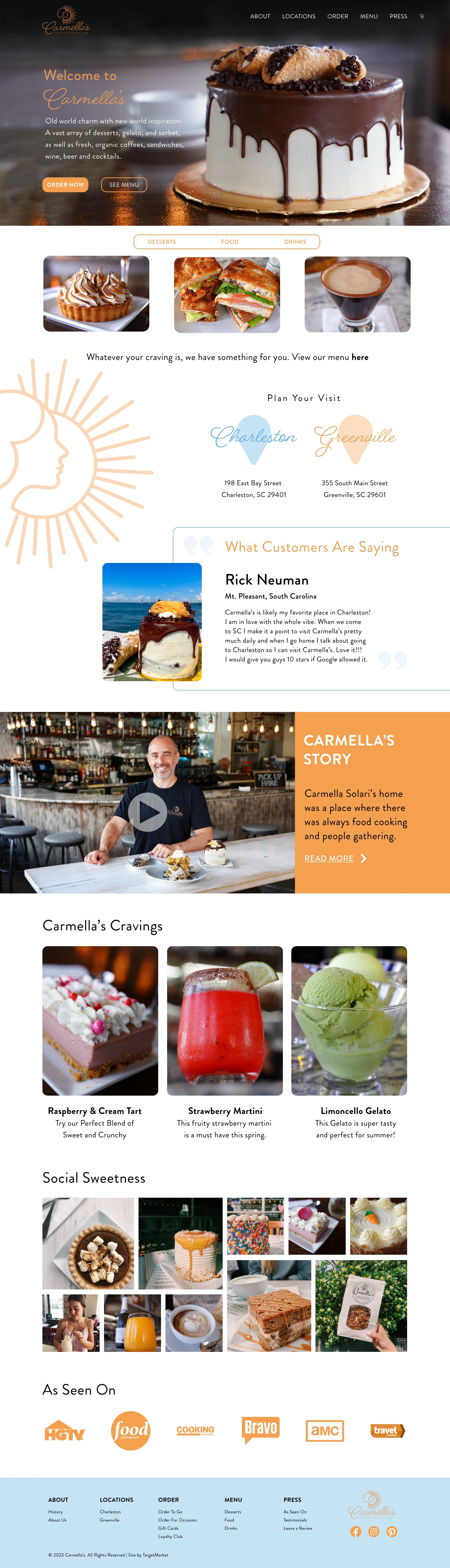
At TargetMarket, I designed Carmella’s website across the homepage and interior pages. The final homepage was published in 2022.
Carmella’s did not have a website before this project. The client wanted a fresh, bold and fun digital presence to reflect its updated menu. I designed the homepage directions, interior pages and mobile layouts, and worked with developers on implementation. Food photography sits at the center, with the café’s existing brand character carried through the experience.
This case study presents the 2022 design work, including the published light-background homepage. Brand identity and photography were supplied as project materials.
A full-width cake photograph sets the tone. Orange accents pick up the warmth of the café’s identity, while light backgrounds give the food photography room to stand out. Menu categories, locations, the café story, and social imagery unfold down the page.
The website needed to feel fresh, bold and fun without taking attention away from the food. Large photographs make the menu the focal point, while warm accents, expressive lettering and the café’s story bring the brand into the surrounding layout.
Desserts, food and drinks appear as distinct categories directly below the hero.
“Order now” and “See menu” provide two visible actions alongside the food photography.
The full page introduces Charleston and Greenville, with addresses and links into the location content.
Orange, teal, and expressive lettering connect the café’s existing identity to a sequence of practical website layouts.
The design extends into location and contact information, menu browsing, and specialty ordering. Shared navigation, orange calls to action, and generous photography connect the pages while each layout responds to a different task.
Specialty ordering / 01
The product grid brings imagery, names, prices and option selection into a repeated layout. Lead-time and pickup information appear below the selection.
Specialty ordering / 02
The product detail layout brings together the cake image, description, size choices and add-to-cart action. Shown here as the next step after choosing a product.
Dedicated location pages bring together local imagery, seasonal favorites, maps, parking, and nearby places to explore.
Responsive web layouts make room for readable content, touch-friendly choices, and a clear path from choosing a cake to arranging pickup.
New mobile adaptations · 2026. Created from the original 2022 desktop designs. The original mobile files are unavailable; these previews demonstrate a new responsive interpretation.
Scroll inside each browser preview, or open a page to try it at your device’s width. The ordering flow is a demonstration and ends before payment.
A dedicated image above readable copy. Tap-to-switch menu categories. One location at a time. A persistent shortcut to specialty cakes.
Image first, details below. Large size selectors replace the desktop overlay. Quantity and price stay connected to the bottom add-to-bag action.
A dedicated pickup step makes the specialty kitchen and lead time visible before review. Date and time have their own labeled controls.
A compact summary gathers the cake and pickup information, with edit links back to each step. The prototype ends before payment.
Choice: Separate the hero photograph from the copy and collapse menu browsing into category tabs.
Trade-off: This adds scrolling and hides the other categories until tapped, but gives each image, headline, and control usable space on a narrow screen.
What to test: Can visitors find a savory item and switch locations without help?
Choice: Replace the desktop product overlay with a dedicated detail page, then separate pickup and review. Keep the primary action near the thumb.
Trade-off: There are more steps, but cake choices and pickup constraints are easier to inspect. Edit links retain a route back.
What to test: Do users notice the specialty pickup location and choose the intended cake size before review?
These are design hypotheses for the new adaptations, not research findings or measured improvements from 2022. Example pricing and pickup details come from the supplied historical designs.
The client felt the dark brown and teal directions were too experimental. We moved forward with the light-background homepage to keep the experience simple while retaining a fun, welcoming character. The earlier concepts below show the alternatives considered before that decision.
Website & mobile layout design: Roshni Vasudevan · Agency: TargetMarket · Client: Carmella’s Café & Dessert Bar · Year: 2022.
Brand identity and photography are shown as part of the supplied project materials. My role covered website and mobile layout design, with developer collaboration during implementation.
The final light-background homepage was published in 2022, and the interior pages were used as designed. The website brought menus, locations, specialty ordering, the café story and supporting content into Carmella’s first digital home.
Explore more work